Before a potential client reads a single word on your website, they’ve already formed an impression. The colours, fonts, and overall visual tone of your site communicate something about your practice within milliseconds. On therapy websites, where visitors often arrive in a state of vulnerability or uncertainty, those split-second design signals matter more than most practice owners realize.
The right combination of colour and typography doesn’t just make your site look professional; it also makes it feel professional. It builds trust, reduces anxiety, and creates the emotional conditions for someone to take the vulnerable step of booking a consultation.
Why Colour Matters More on Therapy Websites
Colour psychology isn’t new, but its application to therapy websites is often misunderstood. The goal isn’t to pick your favourite colour or follow a trend. It’s about choosing a palette that reflects the emotional experience you want visitors to have when they land on your site.
Think about the difference between walking into a clinical waiting room with bright fluorescent lighting and white walls versus stepping into a warm, softly lit space with natural textures and muted tones. Your website creates that same first impression digitally. The palette you choose includes the lighting, walls, and furniture of your online practice.
Colours That Build Trust in the Therapy Space
Certain colour families consistently perform well on therapy websites, and there’s a reason they keep showing up across the practices I design for.
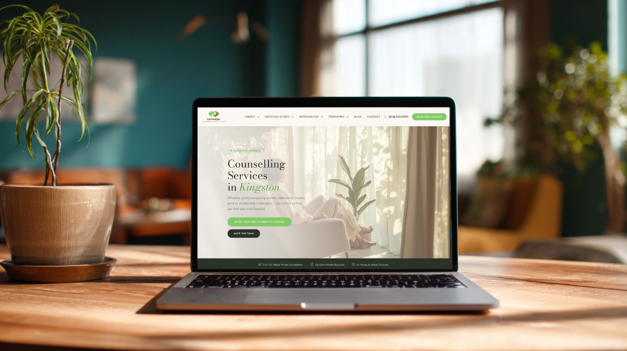
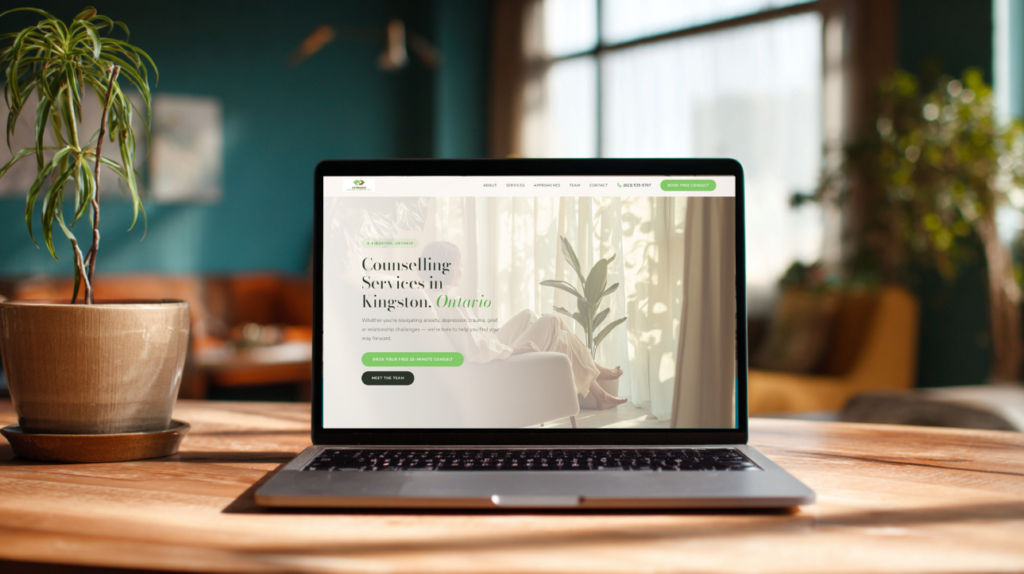
Deep teals and forest greens communicate calm, stability, and grounding. They’re professional without feeling corporate, and they carry associations with nature and renewal that resonate with clients seeking change. These work particularly well as primary brand colours, anchoring the site’s overall feel.
Warm neutrals like cream, soft beige, and warm whites create a sense of safety and openness. They make excellent background colours because they soften the overall experience without competing with your content. A warm cream background feels inviting in a way that stark white never does.
Earthy tones like sage green, warm brown, and muted gold add warmth and sophistication. These work beautifully as accent colours, adding depth to a palette without overwhelming the visitor. They suggest a grounded, holistic approach that many therapy clients find reassuring.
Soft corals and muted pinks, used sparingly, can add warmth and approachability. They work well as secondary accents, particularly for practices focused on relationships, self-compassion, or women’s mental health.
Colours to Use With Caution
Not every colour works in the therapy space, even if it looks beautiful in isolation.
Bright reds and oranges create urgency and intensity. That’s useful for a sale banner on an e-commerce site, but it’s the opposite of what someone experiencing anxiety needs to feel when they’re considering therapy.
Pure black backgrounds feel heavy and can create a sense of confinement rather than openness. Dark mode designs are trendy, but on therapy websites, they often undermine the sense of safety you’re trying to create.
Stark white, while clean, can feel clinical and cold. It’s the digital equivalent of that fluorescent waiting room. If your background is white, warming it even slightly toward cream or off-white makes a noticeable difference in how the page feels.
Overly bright or saturated colours can feel chaotic and overstimulating. When someone is already overwhelmed, the last thing they need is a website that amplifies that feeling.
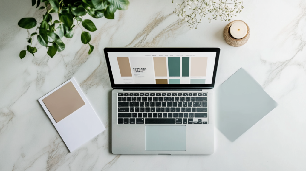
Building a Palette That Works
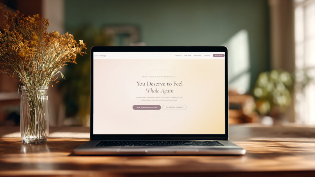
An effective therapy website palette typically includes three to four colours working together. A primary colour sets the emotional tone of your brand—your deep teal, forest green, or navy. A background colour, usually a warm neutral, provides the canvas on which everything sits.
One or two accent colours add visual interest and draw attention to important elements, such as call-to-action buttons and highlighted text. Then your text colour, typically a soft black or very dark shade of your primary colour, ensures readability without the harshness of pure black.
The key is restraint. A palette with too many colours feels disjointed and unprofessional. The most effective therapy websites I build use colour intentionally and sparingly, letting whitespace and typography do the heavy lifting.
Why Font Choices Signal More Than You Think
Typography is the other half of your site’s visual identity, and it communicates just as much as colour. The font on your website tells visitors whether your practice feels warm or clinical, modern or traditional, approachable or authoritative.
Most effective therapy websites use a two-font system: one for headings and one for body text. This pairing creates visual hierarchy, guides the reader’s eye, and establishes your brand’s personality.
Heading Fonts: Setting the Tone
Serif fonts, the ones with small decorative strokes at the ends of letters, tend to feel warm, established, and trustworthy. Fonts like Playfair Display, Petrona, or Lora carry a sense of gravitas and care that works beautifully for therapy practice headings. They suggest that your practice is thoughtful, professional, and grounded.
Modern serif fonts in particular strike a balance between warmth and sophistication. They avoid feeling stuffy or dated while still carrying more personality than a generic sans-serif.
Some practices opt for a distinctive display font for headings to strengthen brand identity. This can work well when done intentionally, but the font must remain legible and align with the emotional tone of your practice.
Body Fonts: Prioritizing Readability
For body text, clean sans-serif fonts like Montserrat, Jost, or Manrope are consistently strong choices. They’re easy to read at small sizes, render well on screens of all sizes, and feel contemporary without drawing attention to themselves.
Body text should never compete with your content. The best body fonts are invisible — they let the reader focus entirely on what you’re saying rather than how it looks. At a minimum, body text should be set at 16 to 18 pixels. Anything smaller forces visitors to squint on mobile, and readability is non-negotiable.
Font Pairings That Work in the Therapy Space
Pairing a serif heading font with a sans-serif body font is the most reliable approach for therapy websites. The contrast between the two creates a clear visual hierarchy while balancing warmth with clarity.
A few combinations I’ve seen work consistently well include Playfair Display headings with Montserrat body text for a classic, elegant feel, Petrona headings with Manrope body text for a warm, modern tone, and Lora headings with Open Sans body text for a clean, approachable look.
The pairing should feel cohesive. If your heading font is ornate and dramatic, pair it with a simple, quiet body font. If your heading font is understated, your body font can afford a bit more character. The two should complement each other, not compete.
How Design Choices Affect Conversions
This isn’t just about aesthetics. The colour and font choices on your therapy website directly impact whether visitors stay, scroll, and book.
A calming palette reduces bounce rates because visitors feel comfortable enough to keep reading. High-contrast call-to-action buttons, such as a warm coral button on a cream background, draw the eye to your booking link without feeling aggressive. Readable typography at the right size keeps visitors engaged with your content rather than forcing them to strain to read it on their phones. Consistent use of colour and type across every page builds the kind of visual trust that makes a new visitor feel like they already know your practice.
When I design landing pages for therapy practices, every colour and font decision is made with conversion in mind. The palette isn’t decorative. It’s functional. You can see how these elements come together in our breakdown of The Anatomy of a High-Converting Therapist Landing Page.
Your Website’s Design Is Your First Therapeutic Impression
As a therapist, you already understand how the environment shapes experience. The temperature of a room, the texture of a chair, the lighting in your office, these details matter because they communicate safety before you say a word. Your website works the same way.
The right colours and fonts don’t just make your site look good; they also make it more engaging. They make a potential client feel like they’ve found the right place.
At Marketing Well, I design therapy websites with this level of intentionality built into every detail. From palette selection to font pairing to how your call-to-action buttons feel on the page, every choice is informed by what I’ve learned across dozens of therapy practice builds.
If your current site doesn’t reflect your practice the way your physical space does, let’s talk about what’s possible.