Landing pages are where therapy practices win or lose the client. Whether you’re driving traffic from Google Ads, social media, or SEO, the page that the visitor lands on determines whether they book a consultation or bounce.
I’ve covered the broader website mistakes in Why Most Therapist Websites Don’t Convert. This post zooms in on the single most important page type: the dedicated service landing page.
Why You Need Dedicated Landing Pages
If someone searches for “EMDR therapy Toronto” and lands on your generic homepage, they have to figure out whether you even offer EMDR, then navigate to the right page, and then find your booking link. That’s three opportunities for them to give up and visit the next practice in their search results.
A dedicated landing page eliminates that friction. The visitor immediately sees confirmation that they’re in the right place, a clear explanation of how you can help, and a direct path to booking.
The Section-by-Section Breakdown
1. Hero Section: Speak to the Pain, Offer the Path
Your headline should name the specific struggle your ideal client is facing, not the modality you use. “Find Relief From the Anxiety That’s Keeping You Up at Night” is more compelling than “CBT for Anxiety.”
Pair it with a clear subheadline that positions your practice as the guide, a prominent call-to-action button (“Book Your Free Consultation”), and a professional, warm hero image. This section should be fully visible without scrolling on both desktop and mobile.
2. Empathy Bridge: Show You Understand
Before selling your approach, validate how the visitor feels. A short paragraph or a list of “signs” that resonate with their experience builds instant connection. Something like: “You might be experiencing racing thoughts that won’t stop, difficulty sleeping even when you’re exhausted, or a sense of dread that follows you through the day.”
This section says, “I see you, and I understand what you’re going through,” which is exactly the reassurance someone needs before trusting a new therapist.
3. Your Approach: Sell the Destination, Not the Map
Clients don’t need a textbook explanation of your modality. They need to understand what working with you will feel like and where it leads. Instead of explaining the clinical mechanics of EMDR or somatic therapy, describe the transformation: calmer days, better sleep, relationships that feel safe again.
You can mention the modality by name for credibility, but keep the focus on outcomes. A sentence or two about the evidence base (“research published in the Journal of Clinical Psychology shows…”) adds authority without overwhelming.
4. Trust Signals: Credentials and Proof
In regulated health professions, you can’t use client testimonials the way other businesses do. But you can still build trust through your credentials and professional affiliations, years of experience and areas of specialization, research citations that support your methods, and a trust bar with registration body logos.
This section doesn’t need to be long. A compact trust bar near the top of the page and a brief credentials section lower down are usually sufficient.
5. How It Works: Remove the Mystery
Booking therapy for the first time (or with a new therapist) is intimidating. A simple three-step process section removes that anxiety. For example: Step 1, Book your free 15-minute consultation. Step 2, We’ll discuss your goals and whether we’re a good fit. Step 3, Begin your first session at a time that works for you.
This gives the visitor a concrete picture of what happens after they click the button, making it much less daunting.
6. Pricing Transparency (When Appropriate)
Not every practice publishes rates, but when you do, it eliminates a major source of hesitation. Visitors who see your pricing and still book are higher-quality leads, and you spend less time fielding fee-related inquiries.
If you choose not to display pricing, at minimum, address it: “Session fees and insurance coverage are discussed during your free consultation.”
7. Final CTA: Close With Confidence
End the page with a clear, warm invitation to book. Restate the core benefit (“You deserve support that works”), repeat your call-to-action button, and include your phone number and email for visitors who prefer to reach out directly.
A Note on Booking Integration
The best landing page in the world won’t convert if the booking process is clunky. If you use JaneApp, I recommend creating dedicated consultation services for each modality and linking your CTA buttons directly to those booking pages. This way, the visitor makes one click and sees one clear choice, no menu of services to sort through.
A designer who specializes in therapy websites will know exactly how to configure this for your platform.
Build Landing Pages That Work for Your Practice
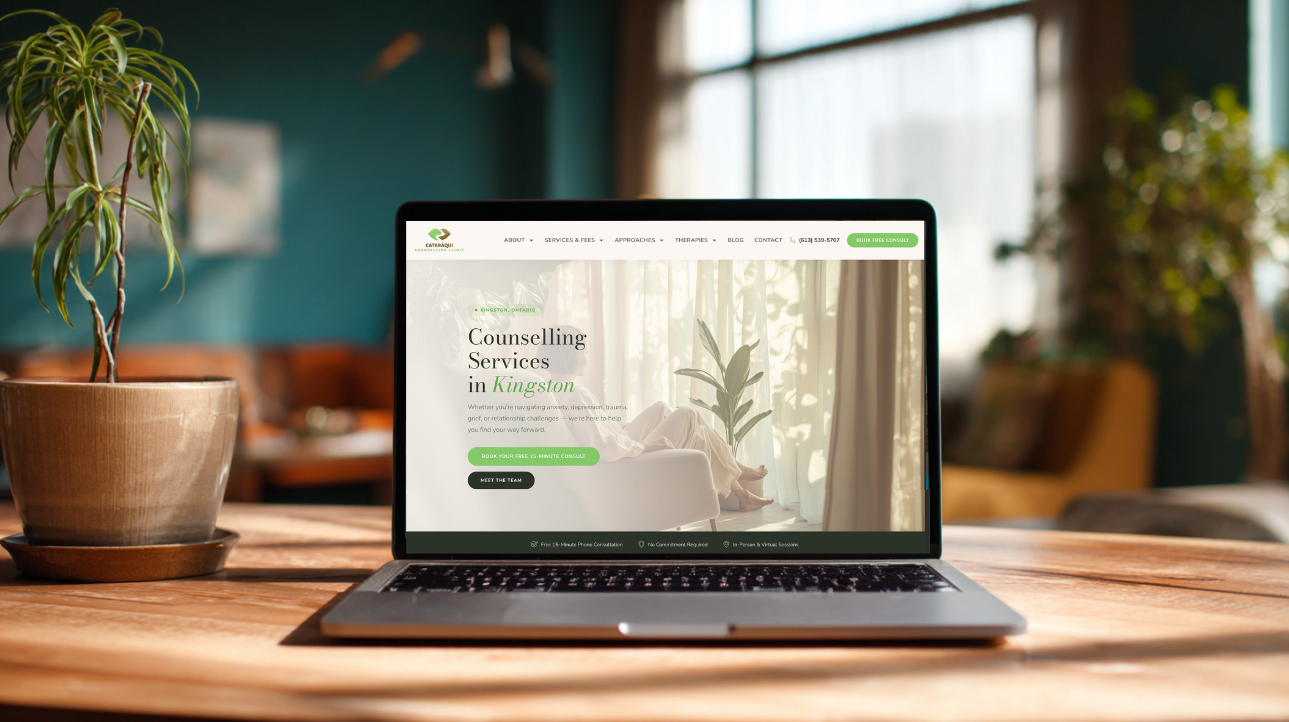
At Marketing Well, I design and build conversion-optimized landing pages and websites for therapy and counselling practices across North America. Here’s an example of an EMDR landing page. Every page follows the structure above, customized to your modalities, your voice, and your ideal client.
Ready to turn your ad traffic into booked consultations? Let’s talk about your landing page strategy.